Understanding the Basics of E-Commerce Web Design
If your e-commerce site makes people think too hard, it starts charging them in attention instead of money. And attention is a terrible currency. It leaks, it wanders, and it vanishes the moment a prettier tab opens next door. Good e-commerce web design keeps that from happening by making the store easy to understand, easy to trust, and easy to buy from.
When I look at an online store, I always end up asking the same handful of questions. What exactly counts as e-commerce web design? Which parts actually help people buy? Why do some stores feel like a clean, bright aisle while others feel like a warehouse after a mild electrical problem? And what should a modern store be thinking about next, besides adding more pop-ups and hoping for a miracle?
“Design is not just what it looks like and feels like. Design is how it works.”
That quote gets repeated so often it risks turning into wallpaper, but it still lands because it is true. The design of a store is the path to the cart, the confidence in the product page, the peace of the mobile layout, and the lack of drama at checkout. If you want a quick refresher on the technical side of responsiveness, I keep pointing people to responsive design basics from web.dev. If you want a plain-language reminder that people must be able to actually use the site, the W3C accessibility introduction is a good sanity check.
In this article, I’ll break down the basics of e-commerce web design in practical terms: what it is, which features matter most, what strong examples do well, and which future trends are worth watching without getting hypnotized by conference-room glitter. The goal is simple: help shoppers move from curiosity to checkout without interface friction stealing the show.
What is e-commerce web design?
E-commerce web design is the structure and presentation of an online store. It covers the way products are organized, how shoppers navigate, how pages look on different devices, and how the checkout flow feels from first click to payment confirmation. In plain English: it is the difference between a store that invites people in and one that hides the door behind a decorative shrub.
It is not just “making things pretty.” Pretty is welcome, but e-commerce design has a job. It has to help people find products, compare options, understand prices, trust the brand, and complete a purchase without unnecessary hesitation. A store can have elegant typography and still fail if the filter menu is a maze and the mobile cart behaves like a haunted elevator.
Think of e-commerce design as a set of tiny but useful decisions. Where does the eye go first? Can the shopper search quickly? Are product photos large enough to show detail? Does the site explain shipping and returns before the customer has to go spelunking for them? Every one of those choices either lowers or raises friction.
Core terms worth knowing
| Term | Plain-English meaning | Why it matters |
|---|---|---|
| Responsive design | A layout that adapts to phones, tablets, and desktop screens. | Most shoppers bounce between devices, and mobile is not optional anymore. |
| Information architecture | The way content and products are organized. | If the store is arranged badly, shoppers feel lost before they ever reach checkout. |
| Conversion path | The route from landing on the site to completing a purchase. | Small friction points along that path can cost real sales. |
| Trust signals | Visual and written cues that make the store feel reliable. | Reviews, secure checkout cues, return policies, and clear contact info all help. |
| Call to action | A button or prompt that nudges the next step. | “Add to cart,” “Shop now,” and “Checkout” should be obvious, not mysterious. |
| Checkout friction | Anything that slows or annoys the buyer during payment. | Every extra step gives hesitation room to breathe. |
The easiest way to remember the whole field is this: e-commerce design is the choreographed part of online retail. It decides whether the store feels like a calm guide or a bargain-bin escape room.
Key features for e-commerce sites
There is no single magic layout that works for every store. A luxury brand, a big-box marketplace, and a niche handmade shop all need different flavors of design. But the strongest stores tend to share the same basic ingredients. I like to think of them as the boring magic: not flashy, but quietly responsible for sales.
| Feature | What it should do | Quick reality check |
|---|---|---|
| User-friendly navigation | Help shoppers reach product categories in a couple of clicks. | Can a new visitor find a category without reading your mind? |
| Responsive mobile layout | Keep browsing, filtering, and checkout comfortable on small screens. | Does the site still feel usable with one thumb and a distracted brain? |
| Secure payment flow | Make the payment step feel safe and obvious. | Are payment options visible, and does the cart explain the next step clearly? |
| Strong product images | Show scale, detail, and context. | Would the customer understand the product if the words disappeared? |
| Clear product descriptions | Answer the practical questions before the shopper has to ask them. | Do the descriptions cover size, material, use case, and the stuff people actually care about? |
| Customer reviews and ratings | Offer social proof and reduce uncertainty. | Do reviews feel accessible and believable instead of buried under six tabs? |
| Fast page load | Keep the experience snappy. | Does the site still feel quick on an average phone and average Wi-Fi, not just on a developer laptop plugged into optimism? |
Responsive design deserves special attention because the mobile storefront is often the real storefront. People browse products on the couch, during lunch breaks, in line for coffee, and while pretending not to be bored in a meeting. If the layout collapses, the buttons crowd each other, or the cart icon is harder to find than a clean sock, the store is quietly losing money. That is why I like to cross-check mobile behavior against the MDN guide to responsive design and, for performance basics, web.dev’s Core Web Vitals overview.
Accessibility matters for the same reason. Clear contrast, readable type, large tap targets, proper labels, and keyboard-friendly interactions are not charity items. They are usability items. And usability is where sales and sanity often meet for coffee.
Navigation: the aisle map of the store
Good navigation behaves like a store clerk who knows the building but does not hover. Shoppers should be able to scan the top-level categories, move into subcategories, and return to the main path without getting trapped. Mega menus can work, but only when they are disciplined. A giant menu full of cute labels and vague category names is not a service. It is a puzzle.
The best navigation systems usually follow a few rules. They keep labels specific. They group related products in ways that match real shopper language. They preserve search as a constant escape hatch. And they make the cart and account area easy to spot without turning the header into a cockpit.
Product pages: where the sale gets serious
Product pages carry the emotional weight of the store. This is where the browser asks, “Why should I believe you?” and the page has to answer with more than a slideshow and wishful thinking. The best pages combine imagery, concise copy, size or fit details, pricing, shipping info, and trust signals without forcing the reader to scroll through endless fluff.
I like product pages that answer these questions quickly: What is it? What does it cost? Why is it worth buying? What size, version, or color am I actually looking at? What happens if I change my mind? When those answers are easy to find, the page starts behaving like a helpful salesperson instead of a mystery box.
Checkout: the last mile where patience gets tested
Checkout is not the place to introduce surprise, because surprise here usually means abandonment. Guest checkout, simple forms, visible shipping costs, clear progress indicators, and obvious payment options all help. If a shopper has already chosen to buy, the interface should not suddenly ask for a memoir.
One of the most useful rules I’ve learned is this: every field, every extra page, and every “are you sure?” moment should justify its existence. If a question is not necessary, it is decorative friction. Decorative friction is cute on a wreath, not on a payment screen.
Examples of successful e-commerce designs
Examples are useful because they keep this conversation from floating away into vague advice soup. The goal is not to copy another brand’s look. The goal is to notice the design decisions that make shopping feel simple, confident, and efficient.
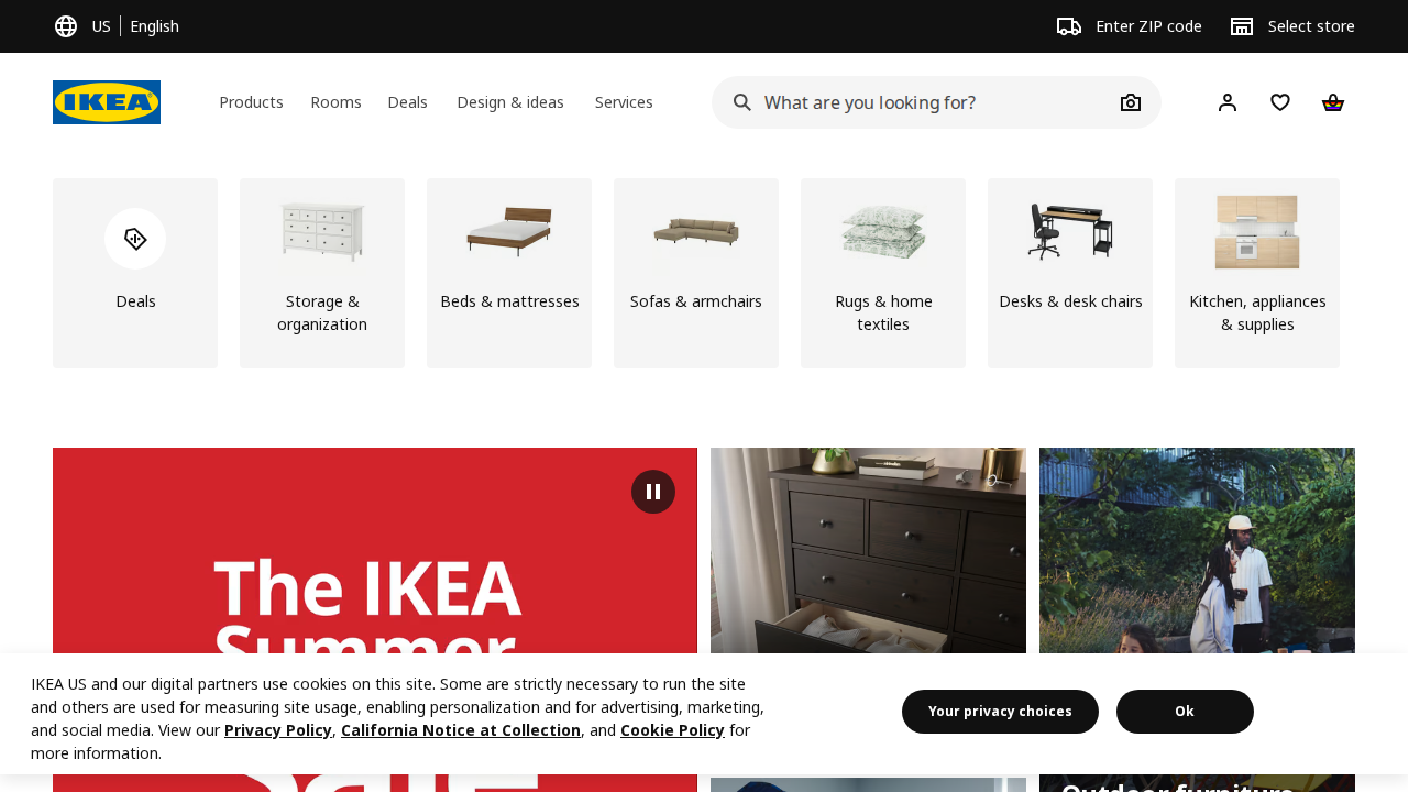
IKEA: category-first clarity
The screenshot in this article shows IKEA’s homepage approach: categories are visible, search is prominent, and the layout gives shoppers obvious next steps. That matters because a huge catalog can become intimidating very quickly. IKEA reduces that pressure by letting the shopper move from broad intent to narrower intent without a bunch of visual noise shouting over the top of the page.
What works here is not decoration. It is structure. The shopper can start with a room, a category, or a search query and get somewhere useful fast. That is a good lesson for any store with a lot of products: the homepage should behave like a map, not a billboard.
Apple: product storytelling with restraint
Apple is a strong example of using visual hierarchy to keep attention on the product. The pages usually have a single dominant message, strong imagery, and a clear path forward. Even when there is a lot to say, the design avoids looking like it swallowed a spreadsheet.
The deeper lesson is that clarity can still feel premium. A store does not need twenty visual tricks per screen to feel polished. Sometimes the smartest move is to remove distractions until the product can speak for itself.
Patagonia: trust, purpose, and practical detail
Patagonia tends to do a strong job balancing brand story with practical shopping detail. The product pages usually make room for usefulness, environmental context, and honest information about fit and function. That combination matters because many shoppers want to know both what the item does and what the brand stands for.
In e-commerce design terms, Patagonia is a reminder that trust signals do not have to be mechanical. A thoughtful product page can say “we know our materials, our process, and our customer” without sounding like a corporate apology note written by committee.
Warby Parker: guided choice without chaos
Warby Parker is a good example of a store that helps people make a decision without overwhelming them. Eyewear shopping can be fiddly because fit, style, and confidence all matter. The design leans on guided selection and strong visuals so the customer can compare options without feeling buried under the options pile.
That is a useful model for any retailer selling products where preference and practical fit both matter. The interface should reduce the emotional effort of choosing, not add to it.
Amazon: scale plus search
Amazon is not famous for elegant minimalism, but it is a useful study in how search, filters, reviews, and category depth work at massive scale. When a site carries enormous product volume, the interface has to behave like a very competent librarian with caffeine. Search and filtering become the hero features.
The lesson for smaller stores is not “be Amazon.” The lesson is that if your product catalog is broad, the design has to make discovery fast. A beautiful store that hides the products is still a poor store.
What these examples have in common
- They make the next step obvious.
- They reduce decision fatigue instead of feeding it.
- They use hierarchy to guide attention, not just to decorate the page.
- They support mobile browsing instead of treating it like a polite afterthought.
- They give shoppers reasons to trust the store before asking for payment details.
If you want a short version of the whole section, here it is: successful e-commerce design is not one style. It is a repeatable pattern of clarity, confidence, and convenience.
Future trends in e-commerce design
Every few years, the e-commerce conversation gets swept up in new buzzwords. Some are real. Some are just expensive confetti. The useful question is not “What sounds futuristic?” It is “What helps the shopper make a better decision faster?” That keeps the site grounded.
Personalization and AI
Personalization is becoming more common because shoppers increasingly expect stores to remember preferences, recommend useful products, and shorten the path to the right item. AI can help with product recommendations, summarizing differences, and support chat. Used well, it can feel like a knowledgeable assistant. Used badly, it feels like a needy algorithm that keeps insisting on socks you already own.
The important design challenge here is restraint. Personalization should feel helpful, not creepy. It should reduce decision effort, not make the shopper wonder whether the site has been reading their diary.
Sustainability in design
Sustainability is not just about product materials. It is also about leaner interfaces, lighter pages, and fewer unnecessary scripts. A faster, cleaner site is often better for users and better for the planet. That overlap is one of those rare moments when good design and common sense shake hands.
For e-commerce brands, sustainability can also show up in honest product information, simpler packaging details, and clearer return guidance. The broader trend is toward trust through transparency instead of trust through vague green-colored marketing copy.
Augmented reality experiences
AR has real promise for categories where size, fit, or placement matters. Furniture, eyewear, decor, and cosmetics are natural fits because they help shoppers picture the product in context. If someone can see a couch in their living room or glasses on their face, they may feel less hesitant about buying.
Still, AR is only useful when it solves a real problem. A flashy feature that nobody uses is just another button asking for attention. The best AR experiences make the purchase decision easier, not noisier.
Voice commerce and chatbots
Voice commerce and chatbots are most useful when they handle routine tasks: product lookup, order tracking, reordering basics, and quick answers to common questions. They can make service feel faster, especially for repeat customers. But they do not replace good navigation, good copy, or a sane checkout flow. A chatbot should be the assistant, not the entire store wearing a fake mustache.
As these tools improve, the design challenge will be making them feel integrated rather than bolted on. If the chatbot interrupts the experience instead of reducing effort, the store has built a talking doorstop.
A practical checklist for better e-commerce design
When I need a quick self-audit for an online store, I use a simple checklist. It does not require advanced theory. It just asks the store to act like a reasonable business instead of a maze with payment options.
- Can a first-time visitor understand the store in five seconds? The purpose, category, and path forward should be obvious almost immediately.
- Can shoppers reach important products quickly? Search, category browsing, and filters should all work without making people feel clever.
- Do product pages answer the common questions? Price, size, color, fit, shipping, and returns need to be easy to find.
- Does mobile browsing feel comfortable? Buttons should be easy to tap, text should be readable, and content should not collapse into a tiny mess.
- Does the site build trust before checkout? Reviews, policies, secure payment cues, and contact paths should all be present and easy to see.
- Is the checkout flow short and calm? Fewer fields, fewer surprises, and clearer progress usually mean fewer abandoned carts.
- Does performance hold up under real-world conditions? A design that only works on a developer’s machine is not a design, it is an optimistic prototype.
If a store fails two or three items on that list, I do not start by adding more color or a fancier banner. I start by reducing confusion. Most conversion problems are not solved by more visual drama. They are solved by less interface friction.
How I would explain the whole thing in one sentence
E-commerce web design is the craft of making online shopping feel obvious, trustworthy, and fast enough that the customer’s curiosity survives the trip from homepage to payment.
That sounds simple, but simple is not the same thing as easy. Good stores are built by people who respect how much effort even a small decision can take when a shopper is comparing products, watching the price, and trying not to get distracted by thirty other tabs.
Conclusion
The basics of e-commerce web design come down to this: the store should help people find what they want, understand why it matters, and buy it without wrestling the interface. Navigation, responsive layouts, strong product pages, trust signals, performance, and checkout flow all work together. If one of them is weak, the whole experience starts limping.
The good news is that you do not need a giant budget or a fashion-magazine layout to do this well. You need clarity, discipline, and a design that respects the shopper’s time. That is usually enough to move a site from “looks nice” to “actually sells.”
If you are planning a redesign or a fresh build, start with the basics before chasing trends. Try the site on a phone. Try it with the sound off and your attention half elsewhere, which is how real people use the web. Then compare what you built against the checklist above. If you want help shaping the structure or turning strategy into a live site, explore our services or learn more about AMK Web Design.
Key takeaways:
- Effective e-commerce design makes shopping clear, not clever.
- User experience matters because it directly affects trust and conversion.
- Responsive design and accessibility are not extras; they are part of the job.
- Strong product pages and simple checkout flows reduce hesitation.
- Future trends like AI, AR, and chatbots only help when they remove friction.
My small experiment for you: open one of your favorite online stores on your phone and pretend you are in a hurry. If you can find a product, understand the offer, and reach checkout without feeling mildly annoyed, the design is doing its job. If not, the site may be stylish, but it is still making customers work too hard.